Orsay
ART IN THE STREETS
For several years, we have been working with the Musée d'Orsay and the Musée de l'Orangerie to design mediation materials for blind and visually impaired visitors, as well as for those with limited access to cultural spaces.
In the exhibition Art in the Streets, these tactile boards are integrated directly into the exhibition path. Visitors can stop and read the image with their fingertips. Discover how we used our high-relief technique to make complex compositions easier to interpret.

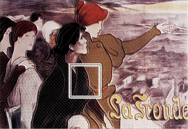
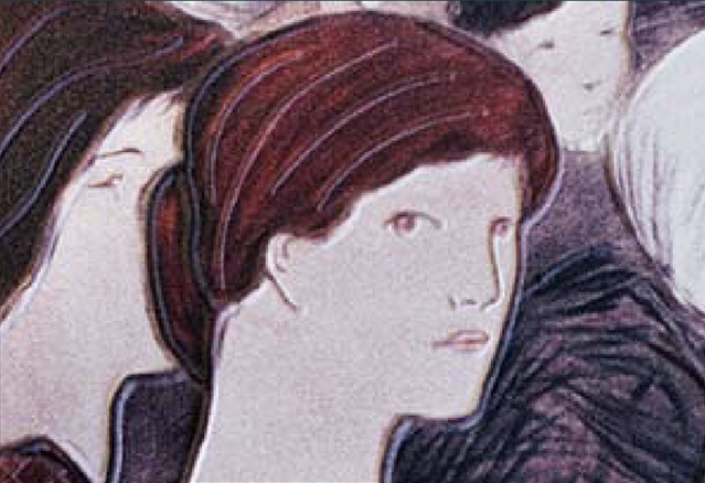
> Detail: zoom on tablets

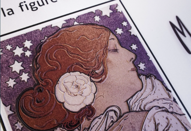
> Tactile reproduction of the poster by Firmin Bouisset
DÉTAIL DU PROJET
High-relief for complex works
We designed tactile adaptations of illustrated posters from the Belle Époque. The graphic compositions of these works are particularly rich, featuring characters, typography, flat areas of color, and narrative details. Tactile design requires a process of interpretation: the goal is not to replicate the image, but to offer a structured reading adapted for touch.
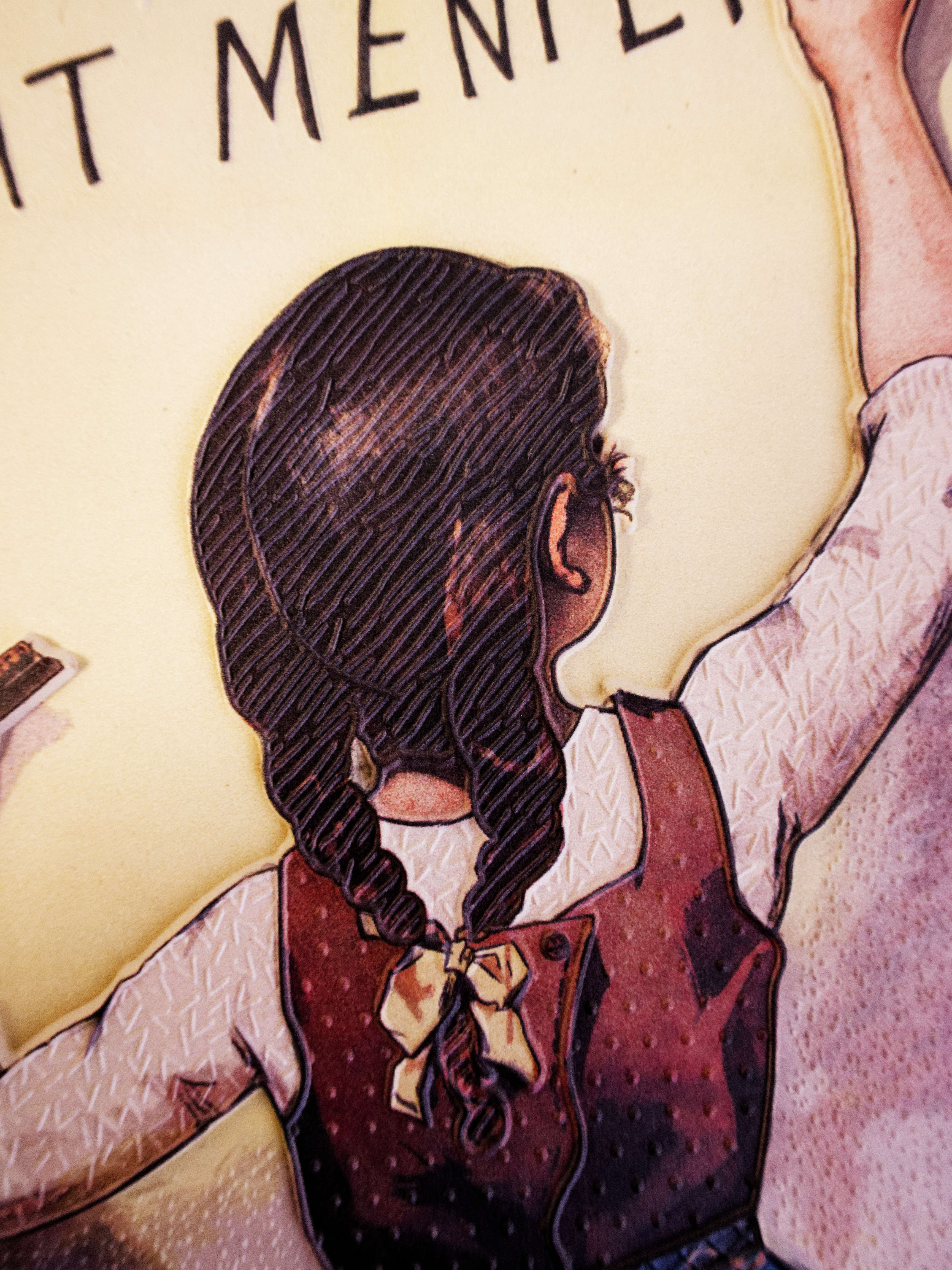
We chose the high-relief technique we developed with the Museum: up to nine levels of relief are used, compared to three for standard relief, to create a hierarchy of image elements. These different levels make it possible to distinguish the overall composition, locate characters, identify details (products, messages, text, etc.), and make the various planes legible. The goal of this mediation is to allow visually impaired visitors to understand the organization of the image while preserving the graphic richness of the works.
Each display also features an enlarged detail, positioned in a dedicated frame. Depending on the work, this highlights a characteristic element: a brushstroke, a pattern, a costume detail, or a piece of typography. This zoom allows visitors to engage with the texture of the work and complements the overall reading.
Three works, three different approaches to interpretation
For the exhibition Art in the Streets, several large-format displays were created. They are based on works by Firmin Bouisset, Alphonse Mucha, Henri de Toulouse-Lautrec, and Clémentine-Hélène Dufau.
The adaptation of these posters is based on a common principle: selecting and organizing the essential elements of the image to provide a clear tactile reading, without attempting to reproduce every single detail.
For the Chocolat Menier poster, created by Firmin Bouisset, the reading is organized around the character. The silhouette, the posture, and the basket filled with chocolate immediately structure our understanding. A few visual cues are enough to place the scene outdoors, notably the grass in the foreground, while the repetition of the brand name makes the image's advertising function clear.
The poster of Sarah Bernhardt by Alphonse Mucha relies on a very different construction. Here, the reading is guided by the rhythm of the lines and the verticality of the composition. The costume, which is very prominent, plays a central role: it elongates the silhouette and contributes to the staging of the character. The main outlines guide the movement of the fingers by following the characteristic lines of Art Nouveau.
With La Fronde, by Clémentine-Hélène Dufau, collective dynamics take precedence. The diagonal structures the reading, particularly with the finger pointing toward the horizon, while the group of women is treated as a coherent whole. The relationships between the figures—proximity, gestures, interactions—make this unity perceptible by prioritizing the reading of connections over individual details. The latter are addressed through zooming, which allows for a more detailed examination of the drapes and fabrics.


> Multisensory experience
Multisensory mediation
Our tools have been integrated into a multisensory experience: we have complemented tactile reading with large-print and Braille texts. Audio content developed by the museum also helps blind or visually impaired visitors understand the works. This complementarity is essential: the tactile image is viewed here as a mediation tool, just as much as words are. It offers another way to access the image, in addition to—or instead of—sight, and is part of a set of resources designed to meet a variety of uses and needs.
From the temporary exhibition to the icon library.
The Belle Époque posters from the "Art is in the Street" exhibition offered us a rich foundation for tactile adaptation through their graphic composition, visual storytelling, and historical context. Transcribing these images into high relief means offering a different way to read the work, one that is attentive to its structure, its intentions, and the way it can be shared with different audiences.
This project is a continuation of our work with the Musée d’Orsay and the Musée de l’Orangerie on tactile design: adapting works from art history to gradually build an accessible tactile icon library for temporary exhibitions, allowing for the creation of custom tours for audiences with disabilities.